Project OverviewGreen Crunch is a food delivery mobile app created for a health food truck with a mission to make their customers happy with good, nutritious healthy meals, raw juices, smoothies and snacks.
|
My RoleUX designer. Responsible for user research, competition analysis, wireframing, prototyping, visual design, mockups, usability testing, iteration, high-fidelity prototype.
|
The GoalThe goal was to design a mobile app that lets users order healthy meals from Green Crunch’s food truck quickly and easily at their own convenience.
|
Target AudienceOne primary user group I identified through my research was health conscious working adults, who do not have the time to prepare their meals.
|
Persona

|
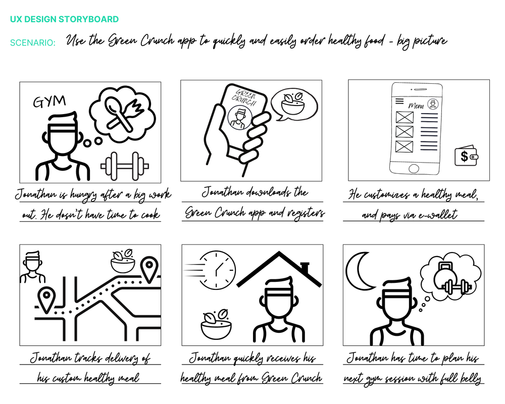
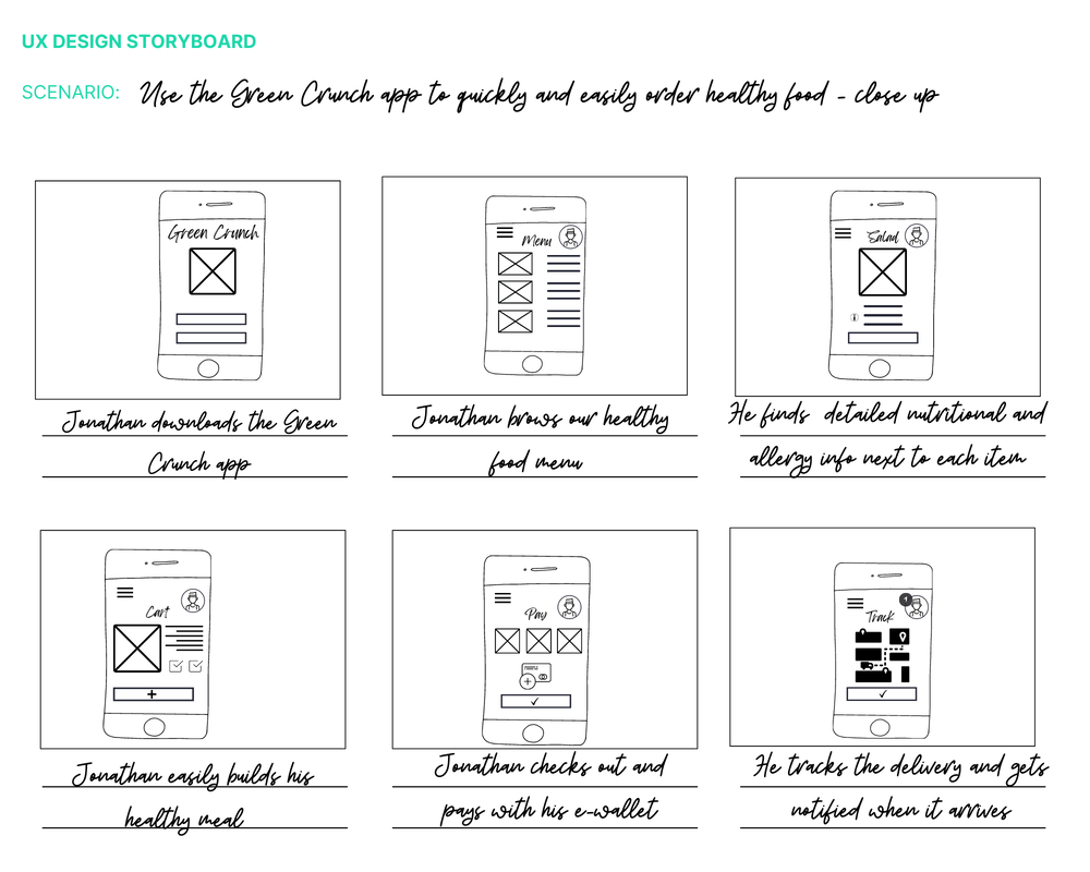
I really want to eat healthy food to fuel my body but don’t have time to cook. Jonathan is a busy fitness trainer, who needs an easy and quick way to order his healthy meals because he does not have time cook. English is not his first language, so he relies on images instead of
food descriptions.
|
How might we - starting the design process
|
|
|
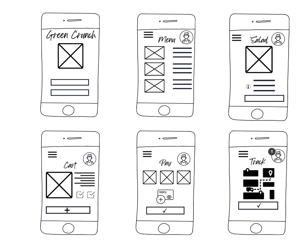
Wireframes
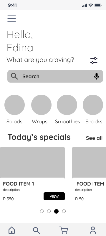
My digital wireframes reflected user research:
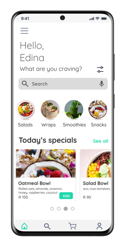
- Search bar on the Home screen to help users find what they're looking for quickly and easily
- Food categories breakdown to help user find food in similar categories
- Adequate use of images to avoid over-reliance on text
|
|
|
|
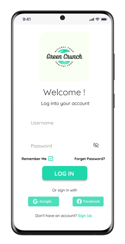
Usability study and some challenges
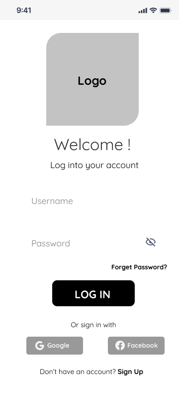
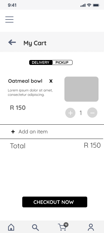
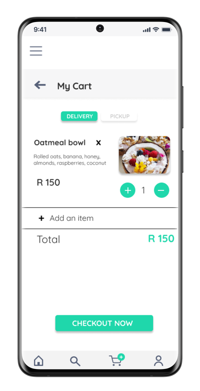
The first usability study revealed that users needs a faster, more intuitive sign-in process and the option to choose between pickup and delivery. The second usability study was conducted using the high-fidelity prototype. Some users with low vision struggled with poor colour contrast ratio and wanted a quicker onboarding process. To fix these issues, I added a pickup/deliver toggle, added a Remember Me feature to the Log in screen and slightly darkened the accent colour to improve the colour contrast ratio.
Mockups
|
|
|
|
“This app makes the process of ordering healthy food online enjoyable. The colour scheme is visually appealing and It’s a pleasure to use this app!”
ConclusionDesigning Green Crunch app helped me understand that I am not the user: After series of interviews and usability studies, I discovered some flaws in my initial assumptions about users of the app.
|
Next steps
|